Design Trends 2006: Color, Photography, and Illustration
More from Nancy Bernard's article in STEP Magazine...
COLOR-Last year color came back as the cautious palletts of the post-bust 9/11 era were overtaken by a new optisim. The colors were mostly soft and light. This year, color has gone three ways: deep, dark, and rich; or pure, strong, and hot.
Orange, which was the color of the avant-garde in the late '90s, is still big. Mainstream designs simply use it to shock, while trendsetters are pairing it with hot, hot pink.
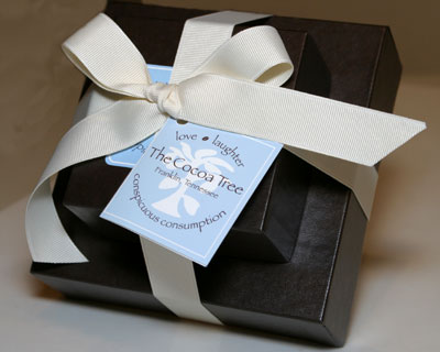
 The big news in color is brown. Yes, people, brown is the new black. Paired with baby pink and blue, rich jewel colors, or black and metallics, brown is really happening.
What's most interesting is the move toward multicolor design. In the past, a piece might have one or two theme colors. Now a few designers are using the whole color wheel, in either pure, hot tones or pastels. (Photo is from The Cocoa Tree)
 PHOTOGRAPHY-The trend in the recent past was to use journalistic or deliberately unprofessional, poorly lit photography. That is SO over. Photography is staged, surrealistic, with very sophisticated lighting. Color is deeply saturated, just like the colors of graphics. This is where you should start to notice that many individual pieces are deploying multiply tropes. See the orange and pink of the Nike environment? (Photography by Bonnie Holland)
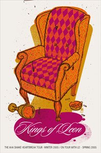 ILLUSTRATION-Illustration has been slowly choking to death since the 1950s. First, because Modernism demanded photography, and later because computers made it easy for designers to create their own imagery. Last year, we saw only two pieces (apart from posters) that used illustration.
No one style dominates, but it's clear that fine art, conceptual, graphic, and calligraphic styles are on the upswing, while retro borrowing is fading out (finally).
If I had to predict where illustration is going, I'd have to say 1969. Mystical hippy styles, appropriately updated, are very big in youth art. By "hippy" I don't mean "op" or "pop". I mean art nouveau ornaments, layered up with rich, dream-like imagery. There's orange and pink again. (Poster from Methane Studios)
COLOR-Last year color came back as the cautious palletts of the post-bust 9/11 era were overtaken by a new optisim. The colors were mostly soft and light. This year, color has gone three ways: deep, dark, and rich; or pure, strong, and hot.
Orange, which was the color of the avant-garde in the late '90s, is still big. Mainstream designs simply use it to shock, while trendsetters are pairing it with hot, hot pink.
 The big news in color is brown. Yes, people, brown is the new black. Paired with baby pink and blue, rich jewel colors, or black and metallics, brown is really happening.
What's most interesting is the move toward multicolor design. In the past, a piece might have one or two theme colors. Now a few designers are using the whole color wheel, in either pure, hot tones or pastels. (Photo is from The Cocoa Tree)
 PHOTOGRAPHY-The trend in the recent past was to use journalistic or deliberately unprofessional, poorly lit photography. That is SO over. Photography is staged, surrealistic, with very sophisticated lighting. Color is deeply saturated, just like the colors of graphics. This is where you should start to notice that many individual pieces are deploying multiply tropes. See the orange and pink of the Nike environment? (Photography by Bonnie Holland)
 ILLUSTRATION-Illustration has been slowly choking to death since the 1950s. First, because Modernism demanded photography, and later because computers made it easy for designers to create their own imagery. Last year, we saw only two pieces (apart from posters) that used illustration.
No one style dominates, but it's clear that fine art, conceptual, graphic, and calligraphic styles are on the upswing, while retro borrowing is fading out (finally).
If I had to predict where illustration is going, I'd have to say 1969. Mystical hippy styles, appropriately updated, are very big in youth art. By "hippy" I don't mean "op" or "pop". I mean art nouveau ornaments, layered up with rich, dream-like imagery. There's orange and pink again. (Poster from Methane Studios)
posted by Toby Sturgill at
6:33 AM
![]()

0 Comments:
Post a Comment
Subscribe to Post Comments [Atom]
<< Home