tasty type
I love good packaging. Packages are proof that good type can make anything look delectable--even puffed corn or sugar water. It's a curse, really. Instead of just picking up any canister of allspice, I get distracted by the pretty colors and fonts that incase it. If I see a canister that looks better than the one in my hand, I put it back and go for what caught my eye. I hate to admit, but I often judge the food by its packaging. Here are just a few of some blog-worthy packages:
Package: Izze Juice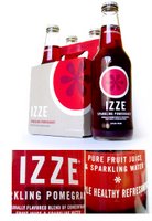
Typeface: Trade Gothic & Adobe Caslon
Izze Beverage Co®. doesn't boast their nonprofit mission on their label, but the design’s simplicity hints that they are a different kind of company. Izze’s sales grew 450% per year over the first two years without any TV, print, or online advertising. Surely their success is due in part to the bottle — clearly branded with Trade Gothic™ caps and a clever use of a Caslon™ asterisk, emulating a cross-section of the fruit contained therein. (HT: Fontshop)
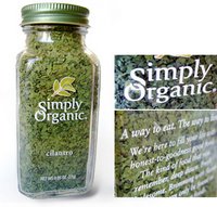 Package: Simply Organic Spices
Typefaces: Sabon & ITC Giovanni
Simply Organic’s® packaging lives up to its name. The clear glass bottle is adorned only with its logo (a carefully customized ITC Giovanni™) and feel-good copy (in Sabon™), revealing the product’s natural goodness. (HT: Fontshop)
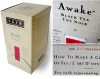 Package: Tazo Tea
Typefaces: Exocet, Nuptial, & Nicolas Cochic
There are few food identities as recognizable as Tazo®. Tea wasn’t very hip until the mid-’90s when tea master Steve Smith came along with his “Marco Polo meets Merlin the Magician” concept. The foundation of this antiquarian style is the Tazo logo — based on Jonathan Barnbrook’s Exocet™. Antique types Nicolas Cochin™ and Nuptial Script™ complete the look. (HT: Fontshop)
Package: Izze Juice

Typeface: Trade Gothic & Adobe Caslon
Izze Beverage Co®. doesn't boast their nonprofit mission on their label, but the design’s simplicity hints that they are a different kind of company. Izze’s sales grew 450% per year over the first two years without any TV, print, or online advertising. Surely their success is due in part to the bottle — clearly branded with Trade Gothic™ caps and a clever use of a Caslon™ asterisk, emulating a cross-section of the fruit contained therein. (HT: Fontshop)
 Package: Simply Organic Spices
Typefaces: Sabon & ITC Giovanni
Simply Organic’s® packaging lives up to its name. The clear glass bottle is adorned only with its logo (a carefully customized ITC Giovanni™) and feel-good copy (in Sabon™), revealing the product’s natural goodness. (HT: Fontshop)
 Package: Tazo Tea
Typefaces: Exocet, Nuptial, & Nicolas Cochic
There are few food identities as recognizable as Tazo®. Tea wasn’t very hip until the mid-’90s when tea master Steve Smith came along with his “Marco Polo meets Merlin the Magician” concept. The foundation of this antiquarian style is the Tazo logo — based on Jonathan Barnbrook’s Exocet™. Antique types Nicolas Cochin™ and Nuptial Script™ complete the look. (HT: Fontshop)

1 Comments:
Totally suckered as well by packaging- Izze for example-never would have picked it up to try it if it didn't have the trendy, refreshing label-flavor-incredible...(I love the grapefruit one).
Post a Comment
Subscribe to Post Comments [Atom]
<< Home